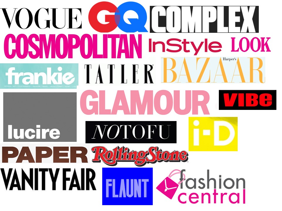
Prelim: Magazine Fonts Moodboard
As magazines are consumer goods, in a way, that makes them a brand, which then means that they have a logo, a masthead to be more specific. A masthead's role is to be recognizable and stand out from the many different magazine mastheads out there. It's not easy to be instantly recognizable which is why the masthead is important as it quickly grabs the viewer's attention and they know what magazine it is straight away. The colour or font, in comparison to other features on the front page, could be the reason whether it is eye catching or not.
I've created a moodboard which shows the different fonts of various magazines. They share some similarities between each other but the difference is most visible. For example, in terms of colour, there is clear difference between that of Cosmopolitan and GQ. This could be due to the audience it is targeted at. Stereotypically, pink is seen to be quite a feminine colour which is probably why the masthead for Cosmopolitan is pink wheras the colours used on GQ are red and blue which could connote to being more masculine.
Also, the way in which it is written can say alot about what the magazine is trying to portray. Fonts come in all shapes and sizes and the specific ones that magazines use have to link in with their housestyle. Vogue is a very well known fashion magazine and it typically uses the colour black for its masthead and a serif font. This implies its professionalism and high end status as it seems to be more prestige looking. Frankie contrasts against this as it uses quite a range of bright and pastel colours for its logo. The actual text itself is also in sans serif font which shows that maybe its quite easy going and relaxed for a magazine. Unlike Vogue, it doesn't have a huge reading and circulation scale which is maybe why it doesn't seem as professional and high end, however it still does its job for an eye catching masthead.
The masthead for Paper magazine is also quite different to the typical ones as it used the colour brown which is not usually common for magazines. Despite this, it relates well to what the magazine is about and brown is a neutral colour that gives quite earthy vibes and connotes to having a grounding foundation which displays the aim for the actual magazine. It is also bold and written in capital letters to show its courageous views.
Overall, the target audience and personal views of the magazine itself influences the result on the masthead to quite an extent as it needs to portray all the themes the magazine puts out.

Comments
Post a Comment